I worked with a Data Scientist and Technical Product Manager to realize the experience and interface design for a new statistical analytics tool for healthcare data.
Requirements had been discussed among the Technology and Business Development teams for over two years, so there was a wealth of ideas to choose from when we worked to establish a workflow for version one.
Interviews with researchers had determined that comparing two data cohorts was an attractive tool to help find important statistical relationships. Users could build two similar datasets, and then select individual outcomes to watch as powerful AWS computers found results for user-determined measures.
Users needed to be able to move back and forth between a number of tasks, running the data in between, saving sets of results then comparing them against each-other.
Individual tasks were also very unique - setting timelines, reviewing then selecting multiple objects, creating a list of measures to watch - necessitating user testing and feedback early and often.
We found users to test with and went to work, meeting in a conference room for hours a day to turn requirements and expertise into wireframes and screens and take them to users. In order to shorten our design cycles, I would rapidly prototype solutions and ideas for the team. Progress was steady and rewarding.
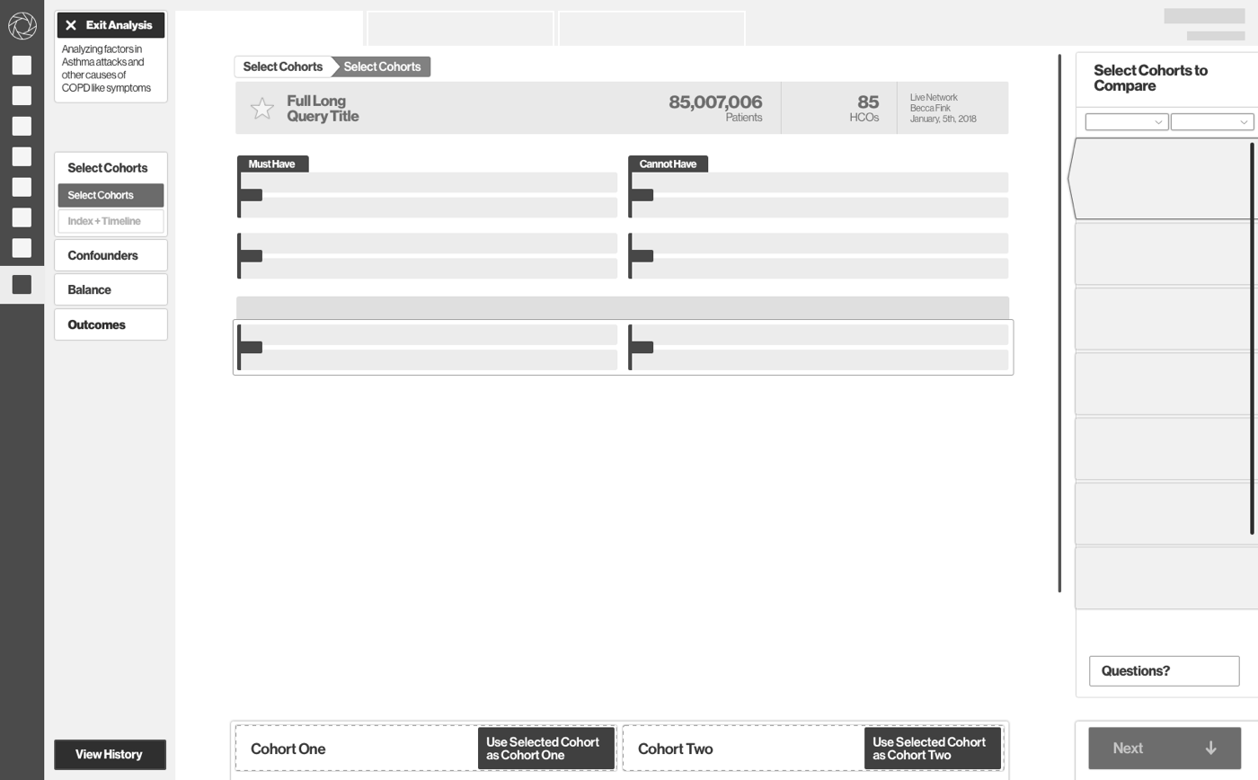
Our unconventional vertical navigation system tested well but setting timelines for analysis required over five iterations and color coding before it became apparent to our test subjects. Our system for selecting cohorts to compare needed a total rework. We met with volunteers willing to sketch their solutions to this problem, a last resort for inspiration.
So many custom interactions required us to trust in our test subjects, but also to choose sensible solutions. We found when something didn’t work, it failed broadly, and when we had a solution, it was well understood. The history tool pushed the Product Manager and I to develop a powerful table where every cell led to a different state.
We worked on a rolling schedule with the development team, turning over the first modules in late January and the last in early March for a May 1 release date.
Overall, our work was well received by platform users who were excited to get access to such a powerful extension of our medical record search product.
Requirements had been discussed among the Technology and Business Development teams for over two years, so there was a wealth of ideas to choose from when we worked to establish a workflow for version one.
Interviews with researchers had determined that comparing two data cohorts was an attractive tool to help find important statistical relationships. Users could build two similar datasets, and then select individual outcomes to watch as powerful AWS computers found results for user-determined measures.
Users needed to be able to move back and forth between a number of tasks, running the data in between, saving sets of results then comparing them against each-other.
Individual tasks were also very unique - setting timelines, reviewing then selecting multiple objects, creating a list of measures to watch - necessitating user testing and feedback early and often.
We found users to test with and went to work, meeting in a conference room for hours a day to turn requirements and expertise into wireframes and screens and take them to users. In order to shorten our design cycles, I would rapidly prototype solutions and ideas for the team. Progress was steady and rewarding.
Our unconventional vertical navigation system tested well but setting timelines for analysis required over five iterations and color coding before it became apparent to our test subjects. Our system for selecting cohorts to compare needed a total rework. We met with volunteers willing to sketch their solutions to this problem, a last resort for inspiration.
So many custom interactions required us to trust in our test subjects, but also to choose sensible solutions. We found when something didn’t work, it failed broadly, and when we had a solution, it was well understood. The history tool pushed the Product Manager and I to develop a powerful table where every cell led to a different state.
We worked on a rolling schedule with the development team, turning over the first modules in late January and the last in early March for a May 1 release date.
Overall, our work was well received by platform users who were excited to get access to such a powerful extension of our medical record search product.
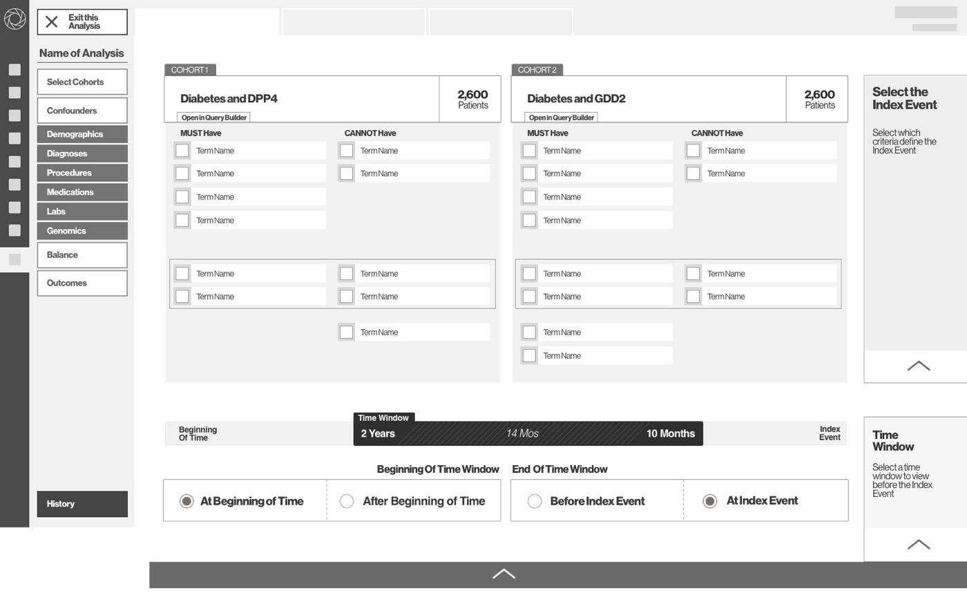
Cohort Selection Screen
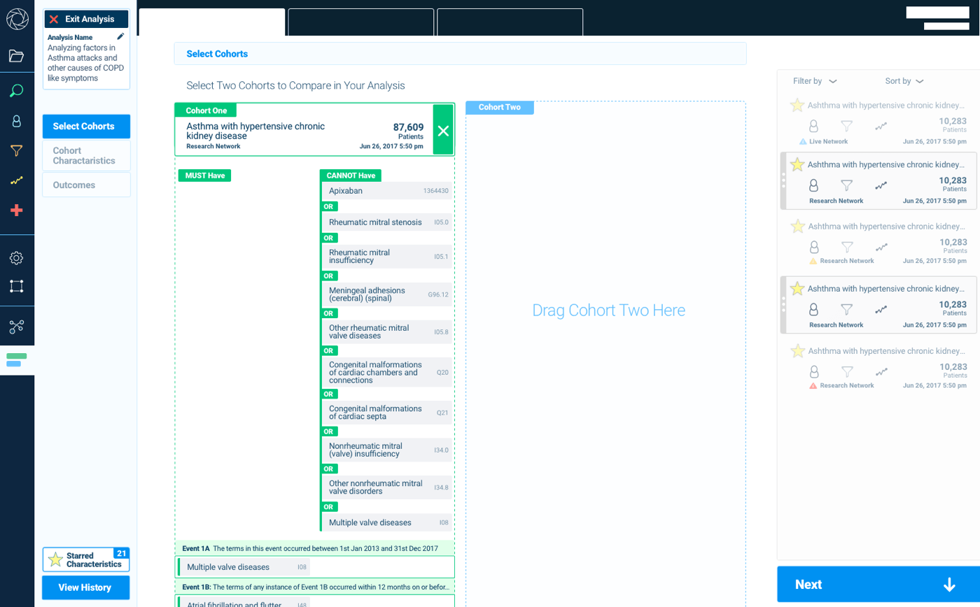
Selecting two datasets to choose between presented an initial challenge. The wireframe below shows my initial approach with buttons, but testing showed that this approach was confusing so we developed a drag and drop screen for the final product which tested much better with users.
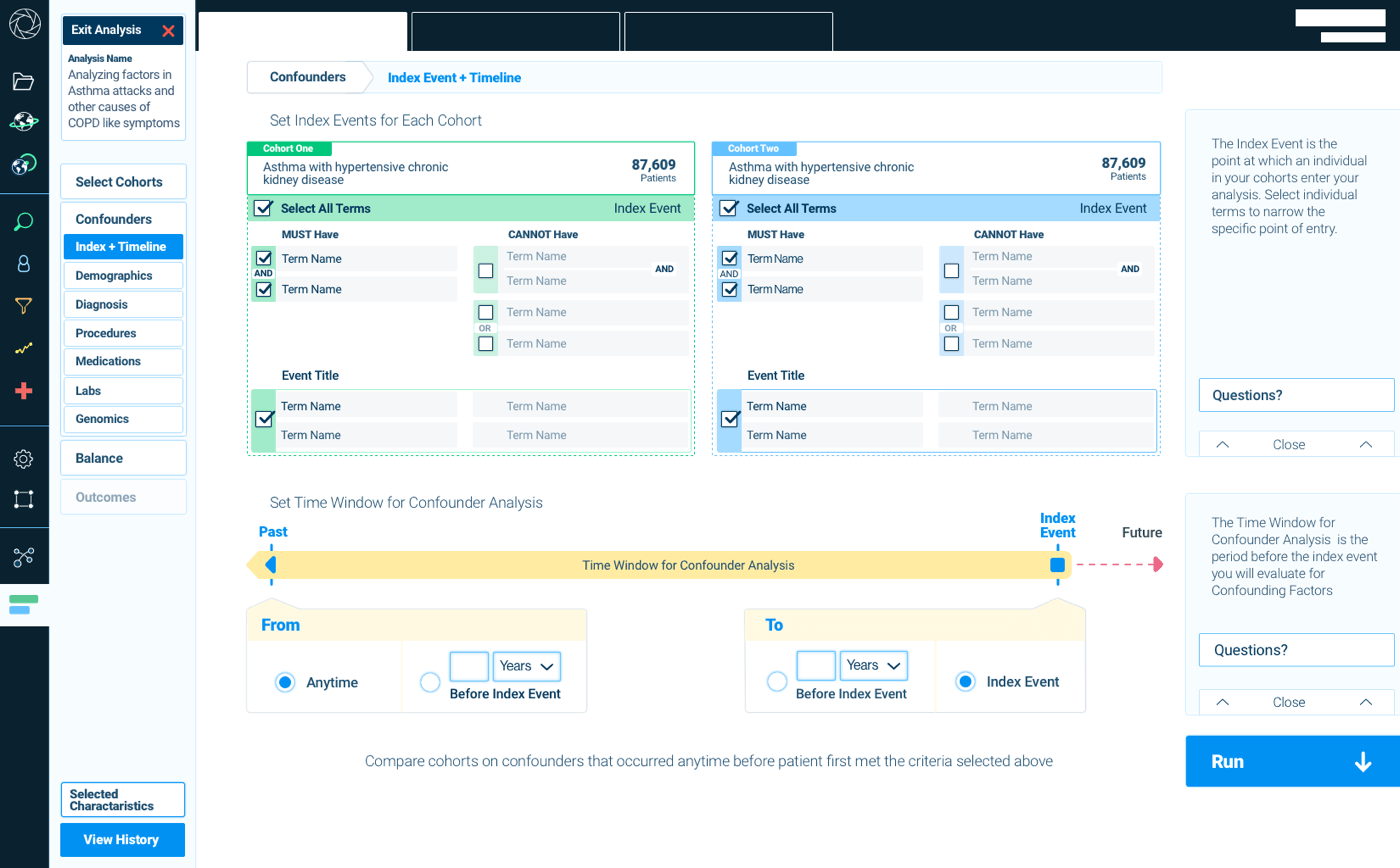
Timeline Selection Screen
Selecting the timeline for analysis was another complex design task. Users needed to select the terms they wanted to search for and select a timeline over which to search for. In initial wireframes the timeline was difficult for users to parse. It turned out that more colorful and direct version was key for people understanding the complex idea in a graphically led screen.
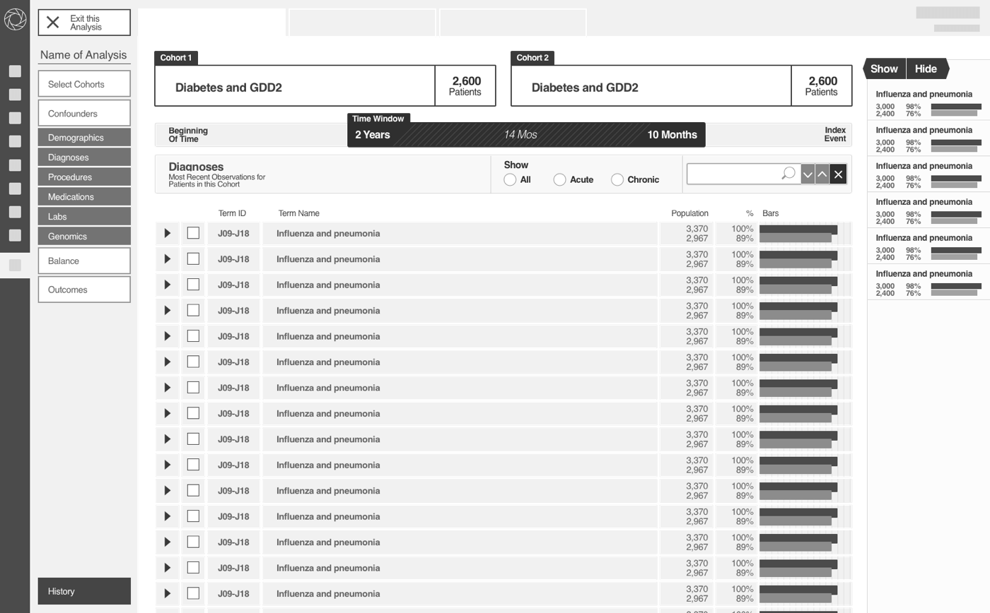
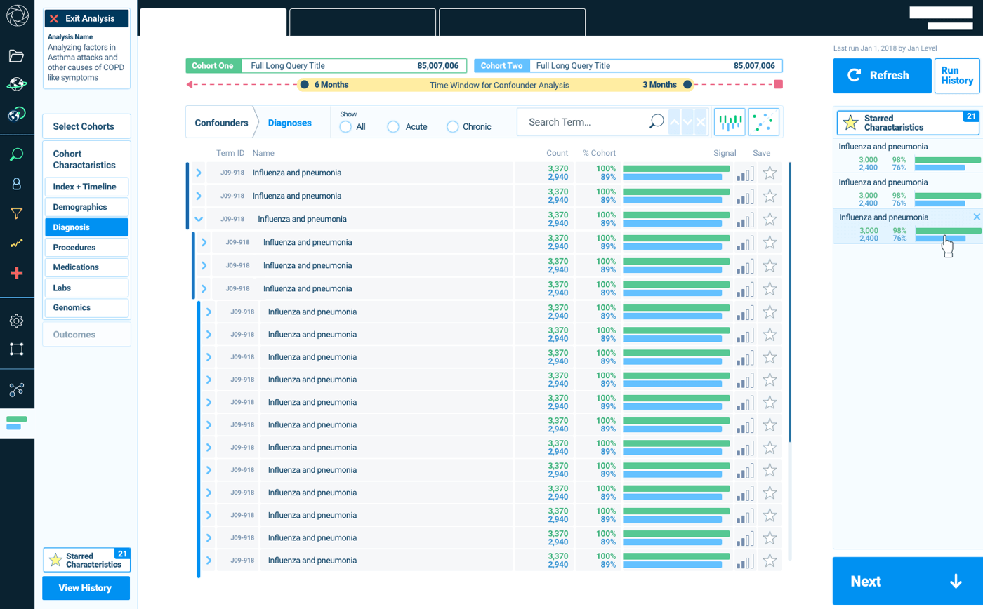
Compare Cohorts Screen
The next step after running a search is comparing characteristics between the two datasets to find issues that could affect the analysis.
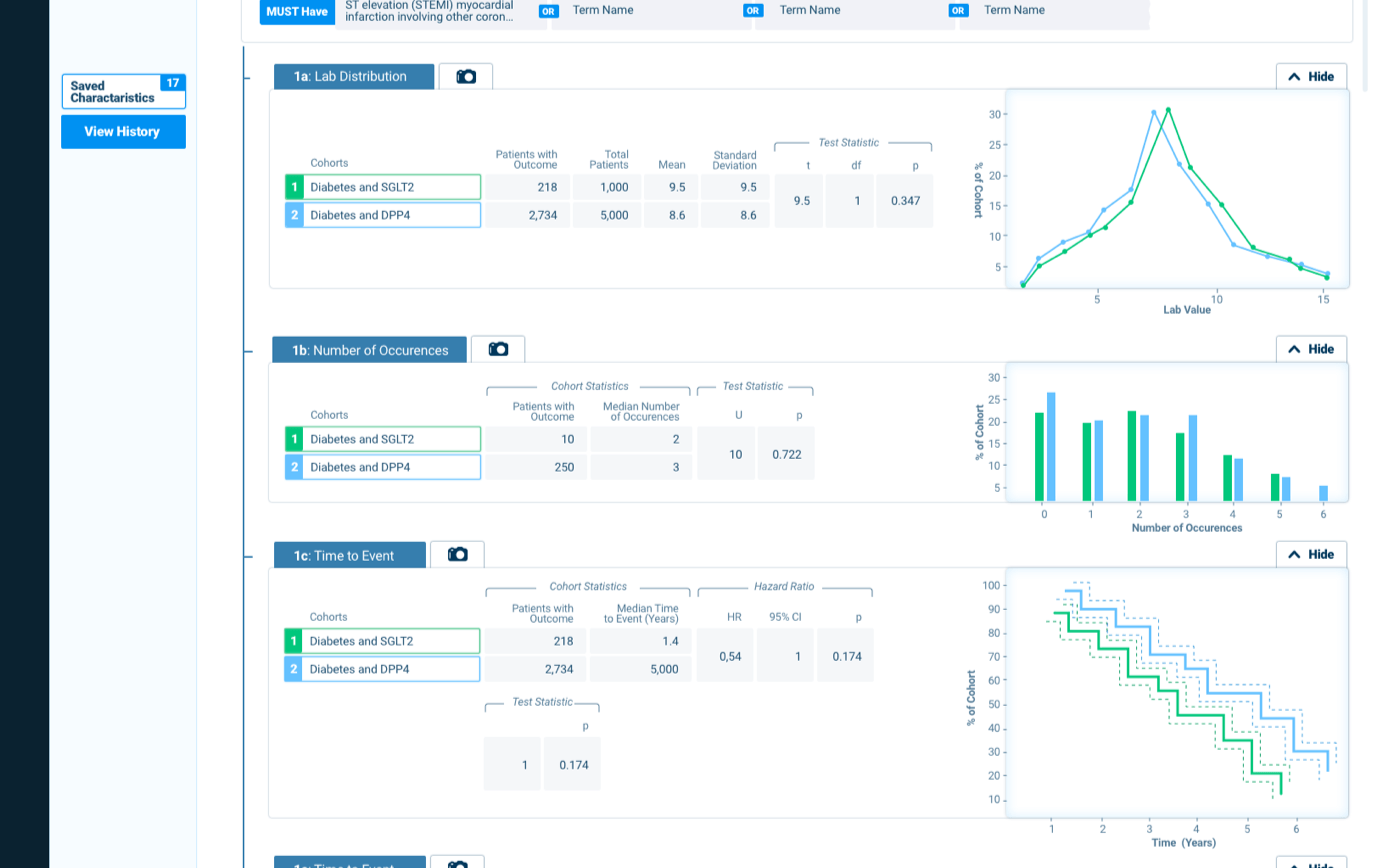
Outcomes
Users then got a detailed outcome screen that showed a number of results in a report.