I worked with a Product Manager and Subject Matter Expert to realize the experience and interface design for a new patient matching tool for clinical trials.
The timeline for this project was tight, so the Product Management team was reluctant to spend weeks interviewing users in order to find the relevant pieces of information to start designing wireframes.
Fortunately, we had a department in house that currently worked to match patients with clinical trials. They were using email to find clinical trial sites with patients that could be included in our client’s clinical trials. The director of the department had significant industry insight, and I began to involve her in order to shorten the time it took to develop an understanding of our users.
Together we worked to create first wireframes with the information that both sides - trial sponsors and trial sites - would want to see in order to evaluate a potential match. We had some preliminary ideas to bring to our company’s annual conference where our users would meet each other for the first time. Mornings packed with quick paper tests and interviews yielded valuable results, and we narrowed our focus and added information.
We had nearly a full product specified out when we learned our development deadline had been set for January 1st, just a two and a half months away. We had also been assigned a team of two developers. While we could have more as the project progressed, our lead engineer explained that they would be less effective as they wouldn’t know the background of the project as well.
I led a meeting with product management and the engineers who white boarded a reduced scope. We would make our date, but I had to set to work removing many of the bells and whistles and finding efficiencies in the interface when possible. Many of my UI improvements were shelved, and the step by step process for the request form from clients would have to rely on an existing UI element rather than the new accordion-style element I had designed.
While I finished the visual design, continual testing largely validated our initial work but offered additional refinements including an important data point our subject matter expert had missed.
Our pharmaceutical clients were excited by the feature set, allowing them to instantly reach out to trial sites whose patients matched their searches in our platform. Working on this small, but powerful software tool, implemented quickly by a team of two engineers was a thrilling experience. We found that by testing with users early and often, we knew our goals well, and were able to launch a successful product.
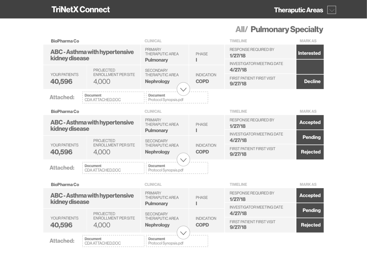
Client View
This view evolved as we tested it with our hospital and clinic users, as well as conformed to the ultimate table style chosen for the application in the final product

Sponsor View
We tested this view with our clinical trial sponsors to ensure the data in the table met their needs, as well as brought the design into a more traditional table view consistent with the rest of the product.


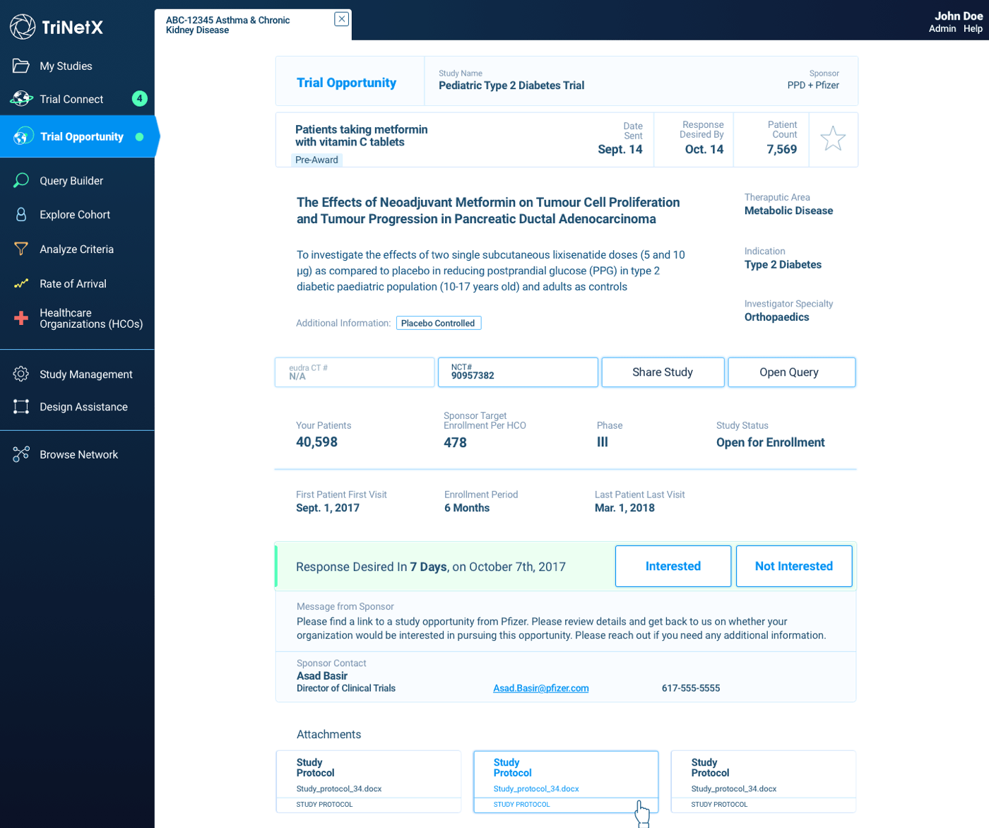
Trial Page
Trials were presented in a simple listing page that combined all the available information into a 4 column centered view.