Healthcare Provider Microsite
I worked with the marketing and copy teams to wireframe and design this microsite.
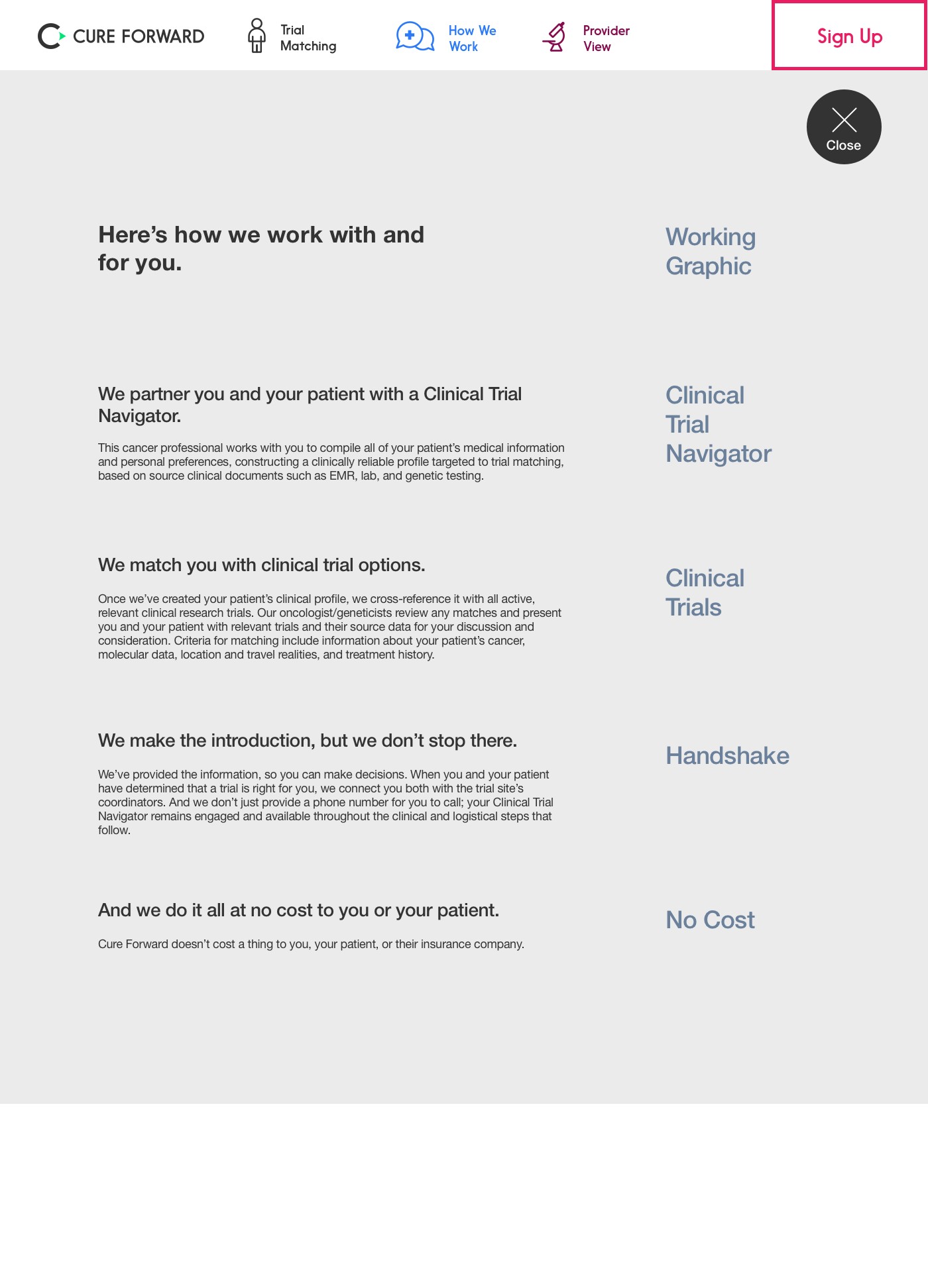
Two rounds of wire frames helped solidify the organization and messaging, and let the teams understand the intent of the graphics.
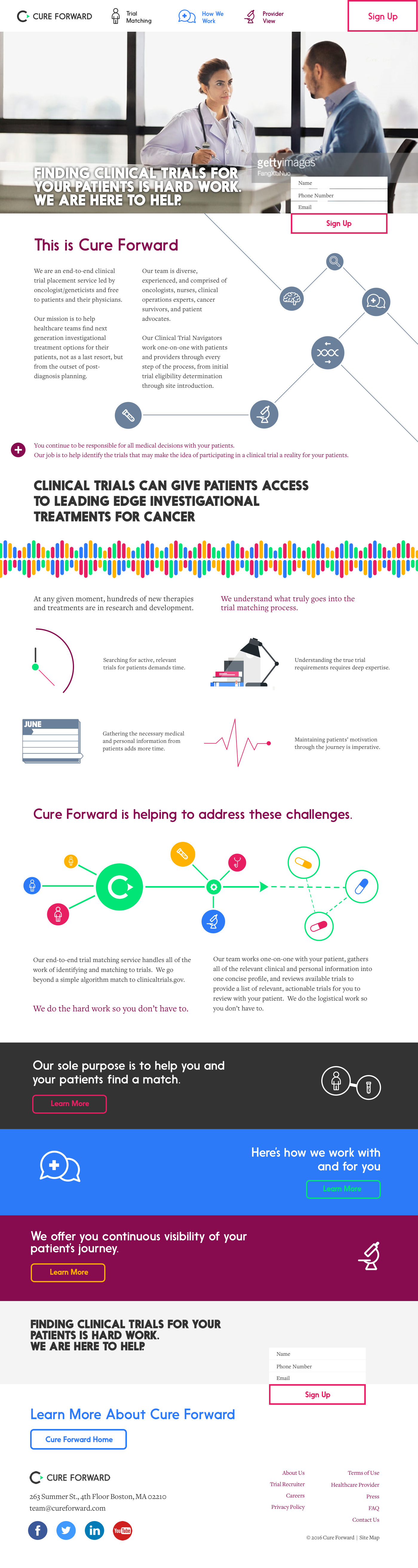
Initial research indicated a persistent sign up panel on the right, but the client wanted a more subtle experience, so it was moved into the menu.
I focused on the initial message for conversion, and moved supporting information to pop-up panels.
I focused on the initial message for conversion, and moved supporting information to pop-up panels.
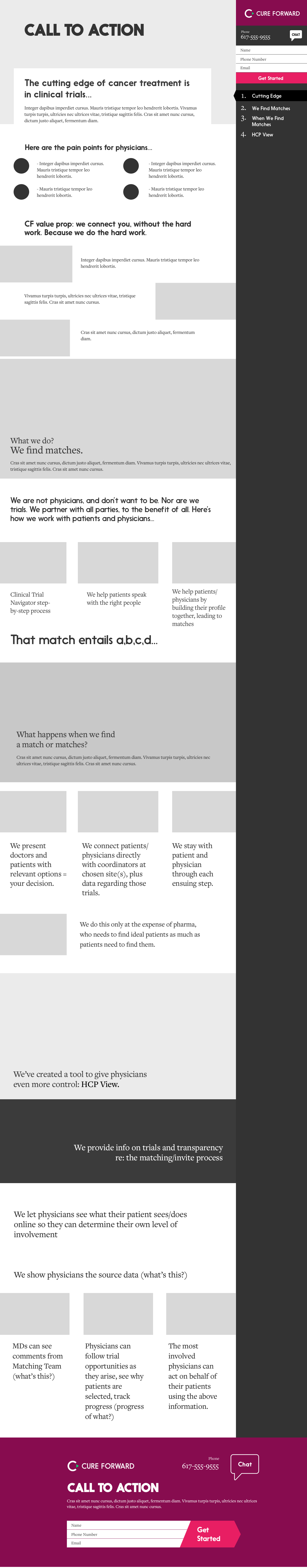


Final Desktop Flat
In the final design, I used the brand coloring with plenty of white to keep it professional for healthcare providers. Spacing give the design a unique look.
Mobile Layout
In the mobile layout, I reframed the graphics for a pleasant experience on iPhone 6/7, our largest device audience.


